This article was originally published on the Imarc blog.
___
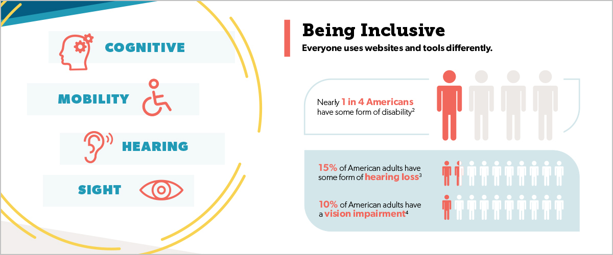
Did you know that 1 in 4 adults in the U.S. have a disability? These disabilities range from mobility to cognition, hearing, and vision. With more and more people turning to online tools for learning and work, inclusivity on the web is more important than ever.
As a company, you want to make sure your website is reachable to as many people as possible. Enter the web content accessibility guidelines (WCAG). These guidelines explain how to make a website more accessible by people with disabilities. In compliance with the ADA (Americans with Disability Act), the WCAG helps web and content developers, designers, and others understand accessibility benchmarks set by the government. If you’d like a more in-depth look at web accessibility, head over to our “What is Web Accessibility and why is it important” post to learn more.
Does my website need to be ADA compliant?
So, I know what you’re thinking – Do I have to redo my website in order to be compliant? It really depends on the type of website and company you have. Federal, state, and local government websites must meet the requirements. If you are an ecommerce website, it is highly recommended. While it may not be required for your business, it is always a good idea to have a compliant website.
Non-compliance can have serious consequences. For example, Target lost a $6 million lawsuit in 2008 because their website did not work well with screen readers. This case was a wake-up call for other large corporations to update their non-compliant websites.
In my professional opinion, there is no reason not to be compliant with the standards. Enhancing your website’s accessibility is a no-brainer. Accessibility almost always leads to increased sales and a better user experience overall. More and more designers and design teams are implementing compliant designs.
The best ways to make sure your site design is accessible
There are many approaches a company can take to ensure their website is compliant; however, these are my top five recommendations for accessibility through design.
- Make sure color contrast is high
- Always be aware of text size, font legibility, font weight, and colors
- Make sure form labels are easy to identify
- Never hide information behind hover states
- Use visual indicators to highlight components
Make sure color contrast is high
The color of your background must have a high enough contrast with your text to be ADA compliant. There are many helpful tools that can assist you in confirming your contrast. Colorsafe.co, WebAIM, and Contrast Checker are a few. There are even apps like Color Oracle that allow you to transform your desktop colors to see what people with specific visual impairment, like color blindness, would see. All these tools are helpful in determining what will work for your website.
Always be aware of text size, font legibility, font weight, and colors
This goes hand in hand with the above tip. Use the online tools mentioned above to determine ADA compliance of font weights and color contrast, and see if your font colors are playing nicely with their background colors. Colors and font weights can’t just be put into a “compliant” or “non-compliant” boxes. Certain colors are compliant at larger text sizes, but non-compliant at smaller sizes. These tools will help ensure you’re utilizing the correct contrast.
Make sure form labels are easy to identify
Always place labels outside of the form field. As trendy as it may be to put labels within forms, once the user begins to input text, the label is lost. This can pose problems for accessibility. Some screen readers are not able to capture words inside of form fields. This means losing context needed to successfully fill out the form, which can result in lost leads and frustrated users. Err on the side of caution, and keep those labels out of the form fields.
Never hide information behind hover states
Screen readers cannot access information behind hover states. This means users can’t access it either and can miss out on potentially key information. Again, do yourself a favor and leave all important information visible and legible for a screen reader.
Use visual indicators to highlight components
These visual indicators can be icons, arrows, or other designs that help the user find information. Never use color alone as an indicator of information. Users who have low visual acuity or color blindness will have difficulty with this information. Use weighted fonts, underlines, icons, or some other visual cue to make information stand apart.
Bonus tip:Never use fast, flashing lights or movement on your website
This is an ADA compliance no-no. People who have visual impairments or epilepsy could be set off by flashing lights. If you do need to have it, make sure to warn visitors and give them the option to turn it off.
Take the next step to get your website compliant
If you aren’t sure where your website stands with ADA compliance, start with a compliance audit. This will help you identify what needs to be changed, determine next steps, and gauge improvements. After making enhancements, you can feel good knowing your website is more accessible to site visitors.
Be sure to take a look at our accessibility infographic and share it with others!